Flexible cover images using intrinsic ratio
 | | Leestijd: ± 3 min.
 We recently changed the way header images are displayed in CAPP Agile Learning. They used to be fixed height and were clipped at the sides depending on the screen resolution. This would hide parts of the image which got really annoying, especially when using text in the image that is being clipped. So what we needed was a way for the images to maintain their aspect ratio.
The solution to our problem was intrinsic ratio, which is often used for creating responsive videos. This technique makes use of the unique way padding-top and padding-bottom deal with percentage values, which will be interpreted as a percentage of the width of the containing element.
Aspect ratio
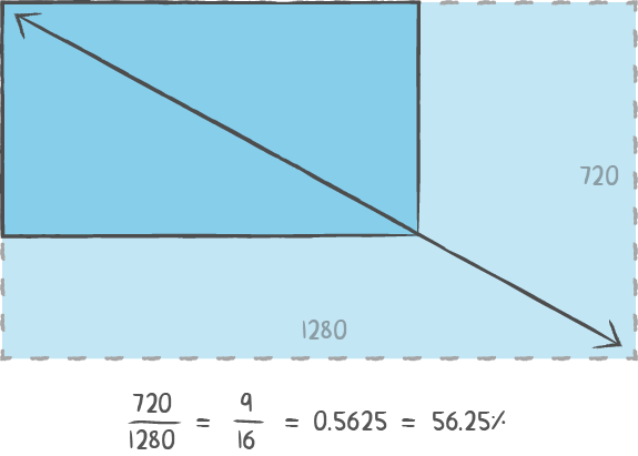
The recommended dimensions for header images in CAPP Agile Learning are 1280 by 720 pixels. The aspect ratio for these dimensions is 16:9 (= 1280:720). To get the needed percentage we divide 9 by 16, which gives us 0.5625 or 56.25%.
Now we can apply the intrinsic ratio trick:
<div class="header-image">
  <div class="ratio"></div>
</div>
.header-image {
  width: 100%;

  &.ratio {
    padding-bottom: 56.25%;
  }
}
The problem with using this aspect ratio trick is that if the element has a max-height declared, it will not be respected. To get around this, we applied this hack to a pseudo-element instead:
<div class="header-image"></div>
.header-image {
  min-height: 300px;
  max-height: 500px;

  &::before {
    content: "";
    display: block;
    padding-bottom: 56.25%;
  }
}
Adding the image
This aspect ratio hack goes really well together with background images, especially in conjunction with background-size: cover;.
Scales the image as large as possible and maintains image aspect ratio (image doesn't get squished). The image "covers" the entire width or height of the container. When the image and container have different dimensions, the image is clipped either left/right or top/bottom.
So if we use a 1280x720px background image it will cover the whole available area without being clipped. This is because padding-bottom: 56.25%; makes sure it will maintain the correct aspect ratio (16:9).
.header-image {
  background: url(header-image.png) center;
  background-size: cover;

  &::before {
    content: "";
    display: block;
    padding-bottom: 56.25%;
  }
}
In the demo below I've added a CSS animation to demonstrate the effect of intrinsic ratio while resizing.
See the Pen Responsive intrinsic ratio w/ background image by Matthijs Kuiper (@snap) on CodePen.
That's all there is to it. With just a little CSS you can scale elements on the fly while maintaining their aspect ratio. If you have questions or cool ideas on intrinsic ratio, please let us know on Twitter!